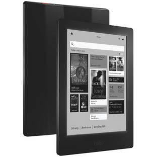
Thinking of buying the Kobo Aura HD? How to does it compare to Kindle Paperwhite or even the Kobo Glo? Since I’m a Kobo kind of person, I thought it only right I take a little look at Kobo’s flagship model that’s bigger, better and beefier than its smaller, less powerful brethren.
The first thing you’ll notice about the new Kobo Aura HD is that it comes in a rather nice brown box, just like a present from ye olden days. It’s a nice packaging upgrade from the previous models, with a simple elegance about it and a rather bookish feel. The second thing you’ll notice is that this latest Kobo model is bigger than the original Kobo Touch and the newer Kobo Glo, both of which we’ve reviewed in the past.
Related: Kobo Glo Review
Related: Kobo Touch Review
Big Screen
Initially, that larger size seems too large – I rather like the compact feel of my Kobo Glo — but once you start using it it’s amazing how quickly you get used to having a bit more space. And it felt nice in the hand at that size too. In fact, it only seems big in comparison to the other models and still fits perfectly into a bag and – at a squeeze – my coat pocket. Heavier than the Kindle Paperwhite by 40g, it’s still very light and not a chore to carry.
The screen on the Kobo Aura HD is far higher resolution than on previous models and that’s the main key to its appeal. The light is better too – offering a better range of brightness levels for those who like their screens just right. All of this puts it into the same league as the Amazon Kindle Paperwhite.
Farewell, quilted casing
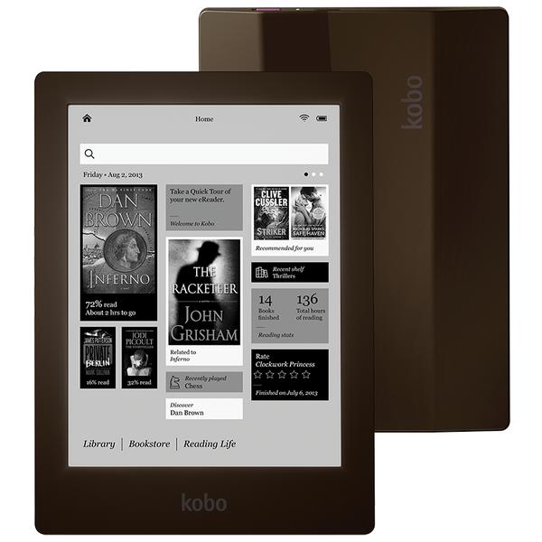
The actual casing is a let down. As a fan of the original quilted back on the Kobo Touch, the Kobo designs have been getting increasingly bland – presumably to appeal to a more mass audience. The Kobo Aura HD has a series of Ivory (or Espresso or Onyx) angled panels on the back that jut out without any of the charm or design of the original. Still, on the whole it feels like a very nicely made product – plasticky but well built.
Using the Aura HD is very easy, with a fairly intuitive, if slightly sluggish user interface that puts your recent reads right there on the home screen for you to find easily. Battery life is excellent, with the e-ink screen drawing just a little power when it refreshes and the LED lights slowly using up the rest.
Pocket in your pocket
For me the most amazing thing about ebook readers is how they have altered our reading habits. Like Stuart (Why my Kindle is changing the way I read), I now spend most of my time reading long form articles and essays. So I was very excited by the announcement that Kobo will now work with Pocket natively. Currently, I use Instapaper and Calibre to put together my long reads, but it’s not exactly slick.
I’d love to tell you what it’s like to use Pocket, but the OS update didn’t appear on my Aura HD review unit in time. Apparently, it is on its way, though. It had better arrive soon because I now have a tonne of articles banked in Pocket that I can’t read.
Update: Typically, I did one last check and the OS upgrade appeared on my Kobo. Pocket works brilliantly! It looks very slick and has been integrated beautifully. It logged me in automatically and all my bookmarked articles appeared on one screen. Where images are included in the article, the Pocket app has created a large thumbnail.
So, what’s the verdict?
I love this ebook reader. Initially I was dubious because I liked the smaller format and the prettier design of the Kobo Touch and Kobo Glo devices. But the high resolution screen and the lovely front light really do make this a pretty winning reader. There are quibbles. It’s still sluggish at times and I’d like it to feel a bit less cheap considering the premium price. But as an alternative to a Kindle Paperwhite, this is more than a match.
Oh, and if you like long reads too, come join us on Stuart’s Non-Fiction Addition Google+ group.
Kobo Aura HD – WH Smith’s
Kobo Aura HD – Check out various prices from Play.com


 Hands on with Blue Microphone’s Mikey Digital for iProducts
 Festive Cake Pops made With Sweet Treats Cake Pop Maker
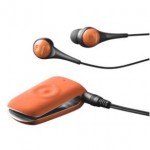 Jabra CLIPPER Bluetooth headphones
 It’s Alive! – Bone Mummy Headphone Wrap
 RSS
RSS
[…] ready to commit to Amazon’s eco-system? Check out this Kobo Aura HD review from our Kobo-loving editor, […]